


I've spent some time reading and watching various resources on Widgets in Flutter, and I'd like to share my insights with you by outlining my approach for a blog post.
So Let's Get started!
Here's what we will cover:
What is Flutter?
What are Flutter Widgets
UI as code
Material Design & Cupertino Design
Types of Widgets
Stateless Vs Stateful Widgets
What is Flutter?
Flutter is an open-source mobile app development framework developed by Google that allows developers to build native-quality applications for iOS, Android, the web, and desktop platforms from a single codebase. It uses the Dart programming language and offers a rich set of pre-built UI components and widgets, along with a robust set of development tools that make it easy and efficient to create beautiful and responsive user interfaces.
To be more precise: Flutter is a special tool that helps people create cool and fun phone apps and computer programmes that look great and work well! It's like having a big box of Lego blocks that you can use to build anything you can imagine, but for making apps instead of toys. Flutter makes it easier for app creators to make their apps work on different kinds of phones and computers without having to write the code over and over again. So, if you have a great idea for an app or game, Flutter can help you bring it to life!
What are Flutter Widgets?
Let's understand Widgets with an analogy.
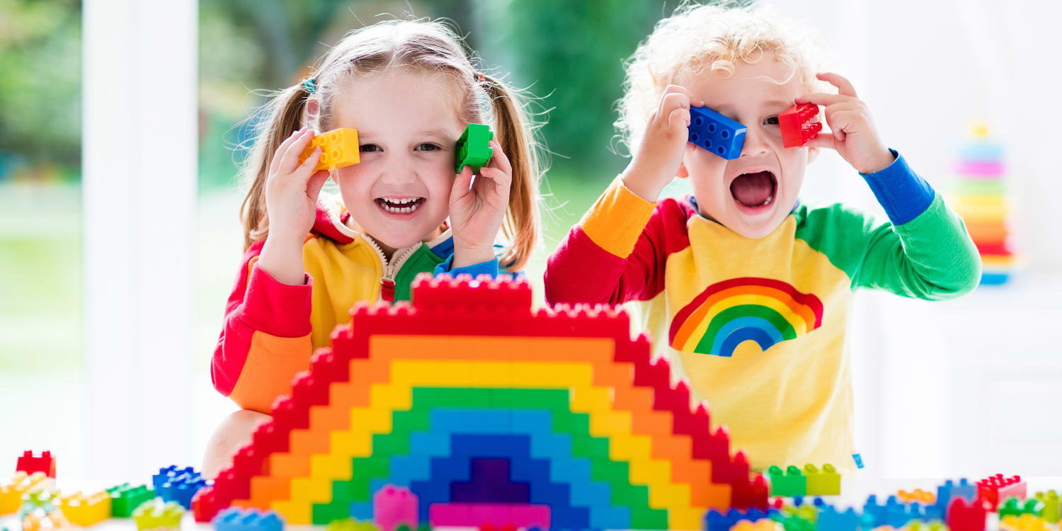
Widgets can be used to create different elements of your app's user interface in the same way that a toddler uses blocks of various shapes, colours, and sizes to build various structures.
For example, you might use a Text widget to display a title or message, an Image widget to show a picture, and a Button widget to allow users to interact with your app.
Similar to how blocks may be stacked, organised, and combined to construct structures of variable complexity, widgets can be used to create simple or sophisticated layouts, apply custom styling and animations, and more.
Widgets are the building blocks of UI in Flutter!
But widgets are more than just UI elements here, They are small pieces of code. Flutter widgets are designed to be highly customisable, with a plethora of characteristics that may be used to change their appearance, layout, and behaviour. These properties can be set in the widget's constructor or by using setters.
Widgets in Flutter are also highly composable, which means that they can be combined with other widgets to create more complex UI elements. This is achieved through the use of widgets like Row and Column, which allow for the horizontal and vertical layout of widgets, and the use of nesting, which enables widgets to be nested inside other widgets to create hierarchical UI structures.
UI as code
Flutter provides a rich set of pre-built UI components and widgets, along with a flexible layout system, that makes it easy to create complex and visually appealing interfaces entirely in code.
Using UI as code has several advantages over visual tools. First, it allows for more precise and fine-grained control over the layout and behaviour of UI components. Second, it makes it easier to reuse and refactor code, since UI components can be easily extracted and reused in other parts of the app. Third, it allows for better collaboration between designers and developers, since designers can provide the UI designs in a format that can be easily translated into code.
Material Design and Cupertino Design
Material Design is a type of design language created by Google that is used to make digital products look and feel more modern and cohesive. It's kind of like having a set of rules for how things should look and work on a phone or a computer. Material Design uses bright colours, flat shapes, and animations to make things look lively and fun. You might see Material Design in apps like Gmail, Google Maps, and YouTube.
Cupertino Design, on the other hand, is a type of design language created by Apple that is also used to make digital products look and feel modern and cohesive, but it has its unique style. Cupertino Design uses more muted colours, and more rounded shapes, and has a sleeker and more elegant look. You might see Cupertino Design in apps like Apple Music, iMessage, and the App Store.
So, both Material Design and Cupertino Design are ways of making digital products look good and work well, but they each have their unique style and set of rules.
Types of Widgets
When working with Flutter, it becomes clear that widgets are a fundamental aspect of the framework. Almost everything in Flutter is a widget, which means that there is already a vast library of pre-built widgets available to use, rather than building them from scratch.
However, while these pre-built widgets are incredibly useful when it comes to building your application, you will still need to start from the ground up.
Widget styles, types, and states vary greatly in Flutter. To get started, let's explore some of the basic widgets that you can use to build your app.
Scaffold widget
Let's say we decided to create a brand new app, and the first thing that we need is a blank screen for our app and this is called Scaffold. It provides a simple and intuitive way to implement the basic structure and components of a material design layout in Flutter.
import 'package:flutter/material.dart';

class MyScaffold extends StatelessWidget {
  @override
  Widget build(BuildContext context) {
    return Scaffold(
      appBar: AppBar(
        title: Text('My App'),
      ),
      body: Center(
        child: Text('Hello, World!'),
      ),
      floatingActionButton: FloatingActionButton(
        onPressed: () {
          // Add your onPressed function here
        },
        child: Icon(Icons.add),
      ),
    );
  }
}
In this example, we define a new widget called MyScaffold that extends StatelessWidget. (Don't worry what is StatelessWidget we will come back to this again!)
The build method of this widget returns a Scaffold widget that contains an AppBar, a body with a Text widget, and a FloatingActionButton with an icon and an onPressed function.
Note that the appBar, body, and floatingActionButton properties of The Scaffold widgets can be customized with any other widget, depending on the needs of your app.
AppBar Widget
In Flutter, the AppBar widget is inbuilt is a Material Design-style widget that provides a top app bar. It typically appears at the top of the screen and contains app-related actions, navigation buttons, or a title.
The basic syntax for implementing The AppBar widget in Flutter is as follows:
AppBar(
  title: Text('My App')
),
Container Widget
If you have a background in web development, you might be familiar with the concept of containers. In Flutter, a container is similar to a div element in HTML, as it serves as a parent widget to other child widgets. The child widgets that are placed inside the container become its direct children, just like in HTML.
In Flutter, A container widget is a box that can contain other widgets. The Container widgets can be used to create padding, margins, borders, and backgrounds for other widgets. The Container Widget, unlike most other widgets, does not add a feature to your programme. It is instead utilised to alter the design and layout of your app. Here's an example of how to use the Container widget to create a box with a red background:
Container(
  width: 200,
  height: 200,
  decoration: BoxDecoration(
    color: Colors.red,
    borderRadius: BorderRadius.circular(10),
  ),
)
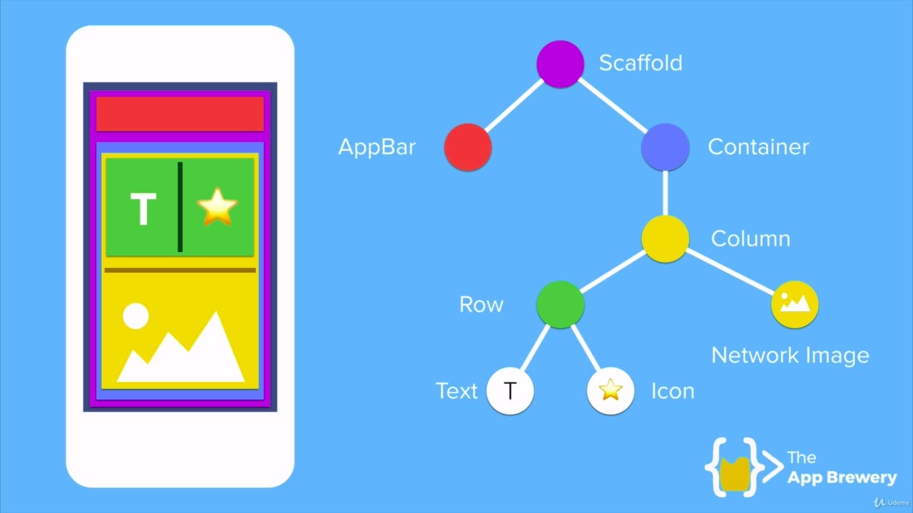
Here is an image (which I took from Angela Yu's Flutter course )that illustrates the anatomy of a Flutter app. Isn't it cool?
Stateless vs Stateful Widgets
In Flutter, there are two types of widgets: StatelessWidgets and StatefulWidgets.
A StatelessWidget is a widget that does not change its state once it is built. It is built once and then remains the same until it is rebuilt. They don't require mutable states Stateless widgets are useful for presenting static content, such as text or images.
A StatefulWidget, on the other hand, is a widget that can change its state during runtime. It can be rebuilt multiple times with different states. These require mutable states. Stateful widgets are useful for presenting dynamic content that can change based on user interaction or other factors.
Here's a flow illustration for Stateless and Stateful widgets (credit: Stack Overflow)

Most of the widgets from the Flutter Widget Catalog are built by extending either Stateless OR Stateful Widget.
There are numerous widgets available in Flutter, and you can refer to the official documentation to explore the complete Widget Catalog. However, it is not necessary to learn all the widgets in the catalog. Plan what you want to build, and how you want your UI to be. And that's it. All you now need to surf the Widget catalog to get what type of widget you need to build your app.
Flutter provides a basic and easy-to-understand UI framework for developing declarative apps.
That concludes the blog. I hope I was able to make you understand what Widgets are. Thank you for taking the time to read it. Have a pleasant day/night!
Ciao!!